FMD Modules Manual
The Forensic Microbiome Database (FMD) is a human microbiome analysis resource that correlates publicly available 16S rRNA sequence data obtained from multiple body sites to relevant corresponding metadata as it relates to forensics, utilizing several analytic techniques:
- Looking at the taxonomic distribution of individual samples from the collected publicly available 16S rRNA sequence data;
- Comparing the taxonomic distribution of multiple samples from the collected publicly available 16S rRNA sequence data;
- Comparing a user-supplied sample to all the publicly available 16S rRNA sequence data and geolocating it through the closest matching taxonomic distributions;
Home Page
The FMD homepage allows users to compare microbiomes and to connect microbiome sequences to geography. The users can explore the publicly available data, use the available tools to compare the available data, and even load their own data. The home page can be accessed from any other page by clicking on the FMD icon in the top left; on the red Home link in the header menu; or in the footer menu.
Header Menu
The header menu allows to explore the database, access the tools, and load their own data. The menu includes:
- Home: goes to the home page
- Analysis: location of all the tools to compare publicly available microbiomes, with the option to load user provided microbiomes, and to explore the connection between geography and microbiota. Tools available from the page include:
- Taxonomic Distribution Viewer: Examine the taxonomic composition of database samples or user uploaded samples using interactive viewers
- Comparative Taxonomic Distribution Viewer: Compare taxonomic compositions of multiple database samples with the option to also include a user uploaded sample
- Geographic Location Prediction: Predict where a user uploaded sample is from based on similarity to samples in the database
- Data: Allows the user to examine and download the data in the FMD
- Data statistics: Summary of the data available in the FMD
- Download Data: page with the links to download the OTU tables used in the database in text file format
- Support: Provides help and information for the user to use the site or examine how the data was gathered and processed
- Contact
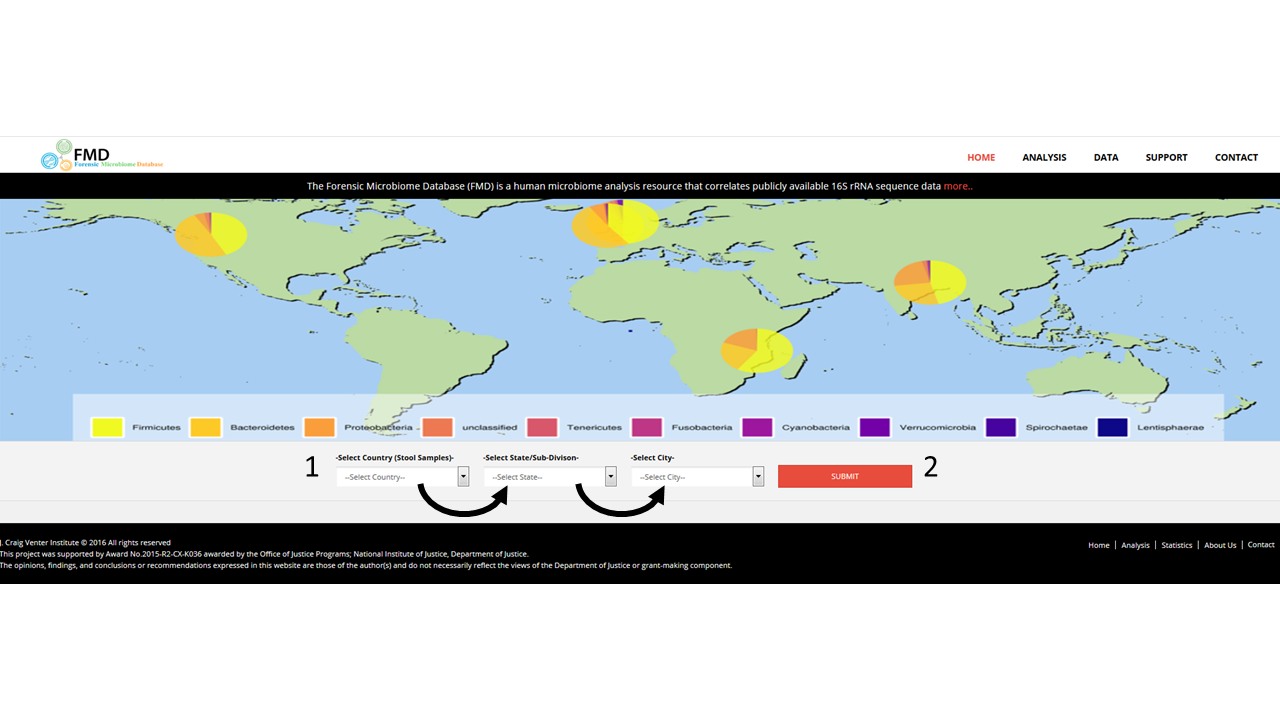
Body
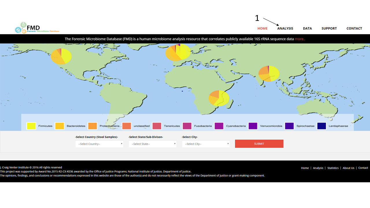
The body of the main page contains a map showing the proportion of stool samples from different countries are from different Phyla. Underneath the map is a set of menus (1) that allow users to create an interactive Krona pie chart of the distribution of the genera from different stool samples from different cities. The menus are auto-filled after the menu to the left is selected, and the Krona interactive image is loaded by clicking on the submit button (2).
Footer
The footer contains several additional links, including:- JCVI: this website is supported by JCVI and the DOJ under the grant cited below
- Home: Goes to the home page
- Prediction: Loads the FMD analysis page as described below
- Statistics: Summary of the data available in the FMD
- About Us: Gives a brief description of the FMD project
- Contact: provides a form to contact us

Analyses
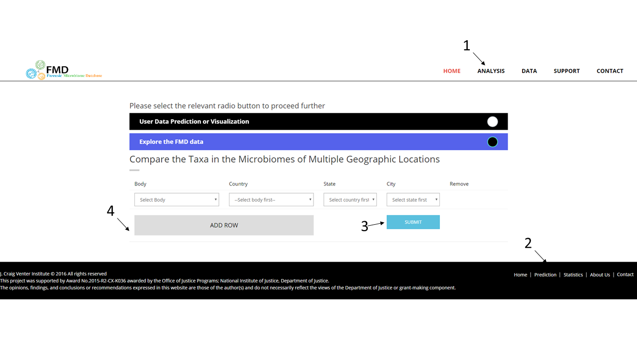
The FMD allows users to estimate the geographic origin of a sample or group of samples by comparing its 16S rRNA community profiles to the samples collected worldwide by the FMD project. To access this tool, click over the Analysis menu option (1).
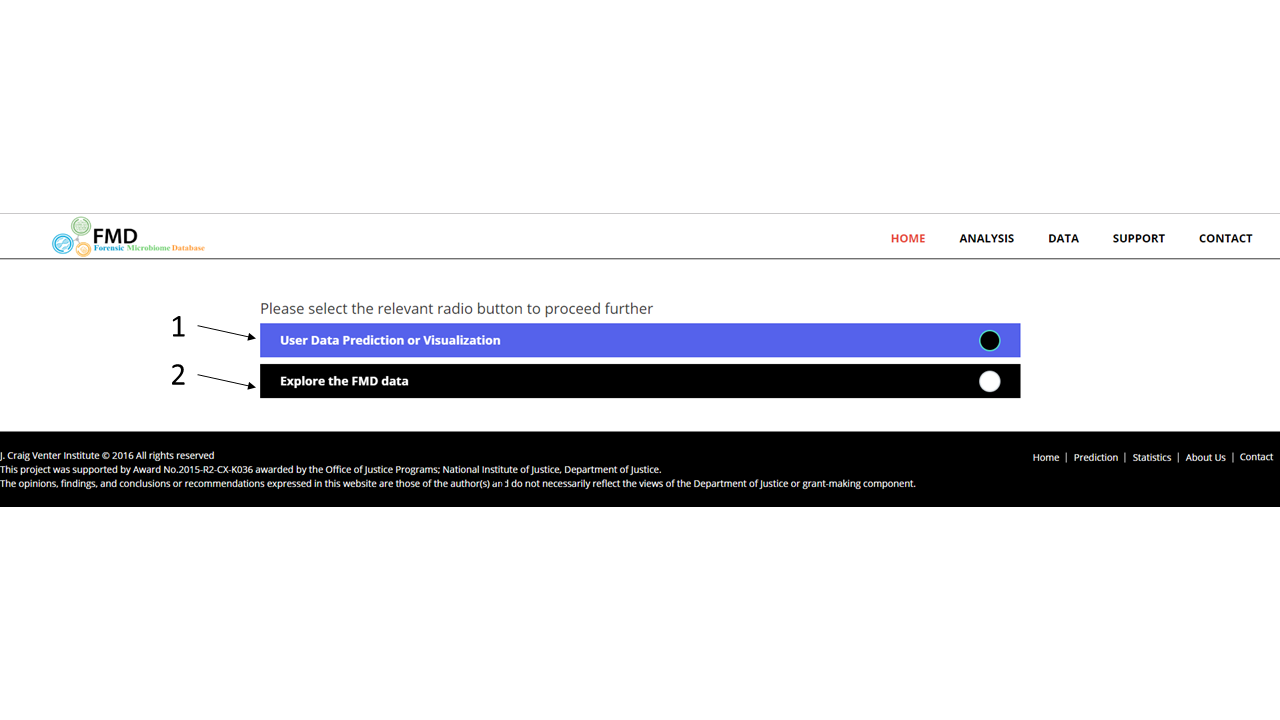
Once on the analysis page, FMD prompts users to either select to provide their own data to analyze and to compare to the FMD data (1) or to only analyze the existing FMD data (2).
Loading Files
If the first option (1) is selection, the user is requested to upload two files that describe the taxonomic distribution of the sample to assay. The two files are outputs from the mothur open-source microbial community analysis pipeline: the shared (file.shared) file- a file containing the counts of each operational taxonomic unit (OTU) across samples- and the taxonomic (file.taxonomy) file- a file containing the taxonomic ID hit for every OTU. Acceptable file names are limited to "*.shared" for the shared file and "*.taxonomy" for the taxonomy file, all in lower case where * can be any alpha-numeric characters. To run the geographic prediction, load in the two files, "otu.shared" (2) and "otu.taxonomy" (3) and select "Submit For Prediction" (4) to load the full results page. To only run the visualization and comparison tools, select "Submit for Visualization" (5).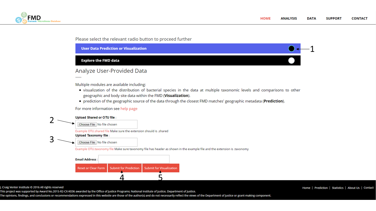
File Formats
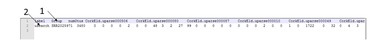
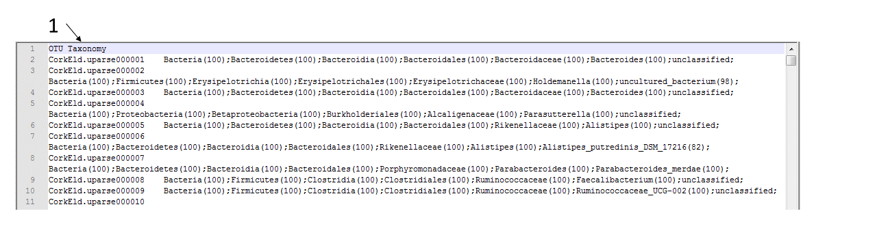
Examples of the two files are available on the page. The shared file contains the raw counts of each OTUs across samples. The header contains the names of each OTU labeled as "otu1, otu2, otu3... otuN" (1) and the second row contains the name, the total count of identified OTUs and the subsequent columns show the counts for each OTU across the sample (2).
The taxonomy file contains matches between the OTUs in the shared file and its taxonomic classification. The header is required to be "OTU\tTaxonomy\n" (1). Each OTU is defined as a group of sequences sharing >97% 16S rDNA similarity.
Users Results Page
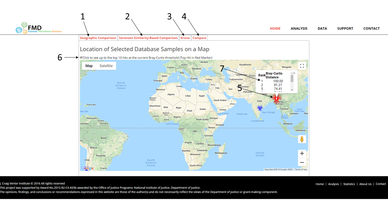
The results page has multiple comparison viewing options: the geographic view (1), the otu similarity polar view (2), the Krona taxonomic comparison (3), and taxonomic comparison view (4). Both views use the Sorensen Similarity Index to calculate the distance or degree of similarity between uploaded sample and reference data. The Similarity Index uses the OTU presence and abundance counts between two samples and goes from 1 (=100% matching data) to 0 (=0% matching data). The geographic view is the default, but the other views can be accessed by clicking on the tab. The geographic view uses Google Maps to generate pins at the locations for with matching samples, with the location with the most similar reference sample shown in red (5). The map can show either all the matching references given a threshold defined in the polar graph or just the top ten closest (6). Inside the pins are the number of matching samples at this location. Hovering over a pin will show a pop-up window with the matching samples rank and their Sorensen similarity value (7)
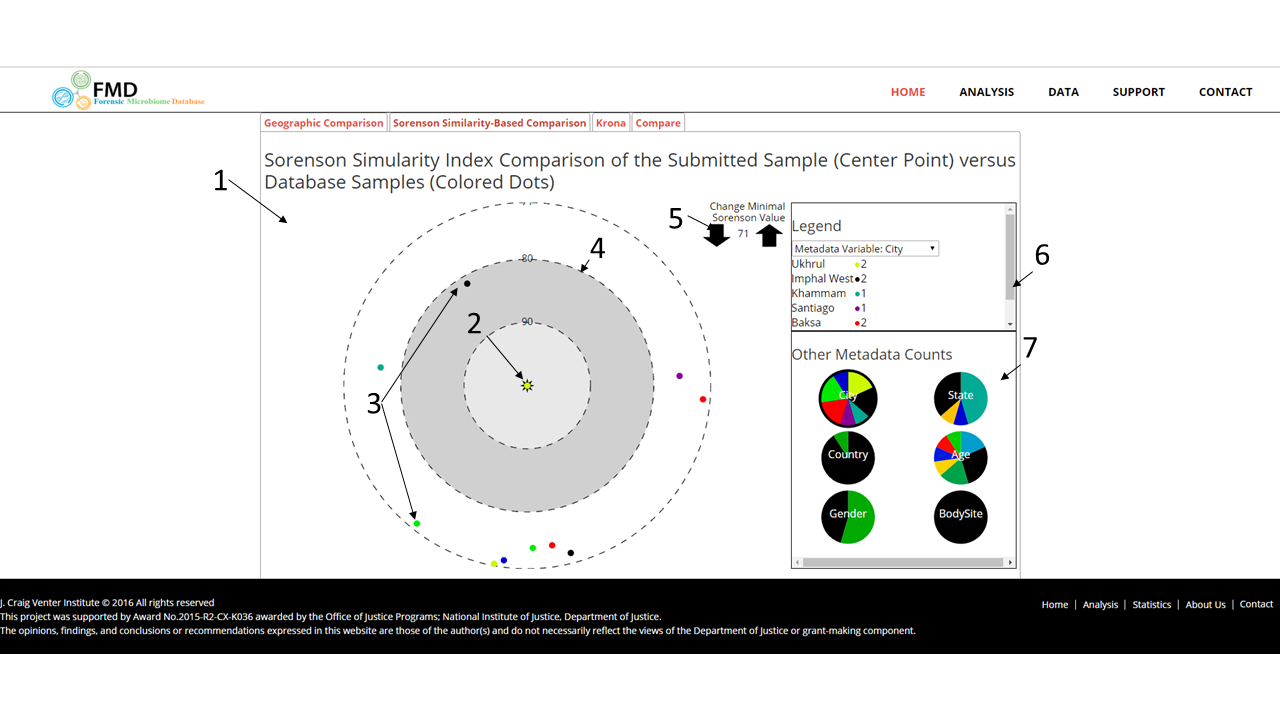
The polar graph shows the degree of similarity between the uploaded sample and the reference samples along with the metadata values of those samples. The figure shows the polar graph on the left (1) with the uploaded sample in the center shown as a star (2) and the reference samples as colored points surrounding the star (3). The polar graph is constructed of concentric circles of decreasing Sorensen similarity scores with the location of a reference sample point based on it, such that the distance between the reference point and the star indicates how similar the reference sample is to the uploaded sample. Guide circles at given levels are shown on the graph (4). The minimal Sorensen value for displayed reference samples can be changed by using the arrows above and to the right of the polar graph (5). The colors are based on metadata values which are shown in the legend window on the top right along with the number of visible samples equaling that value (6). The metadata variable selected is shown in the bottom right with a darkened pie chart (7). The pie charts show the distribution of the variables within the observed reference samples. To change the variable, the user can click on other pie charts.
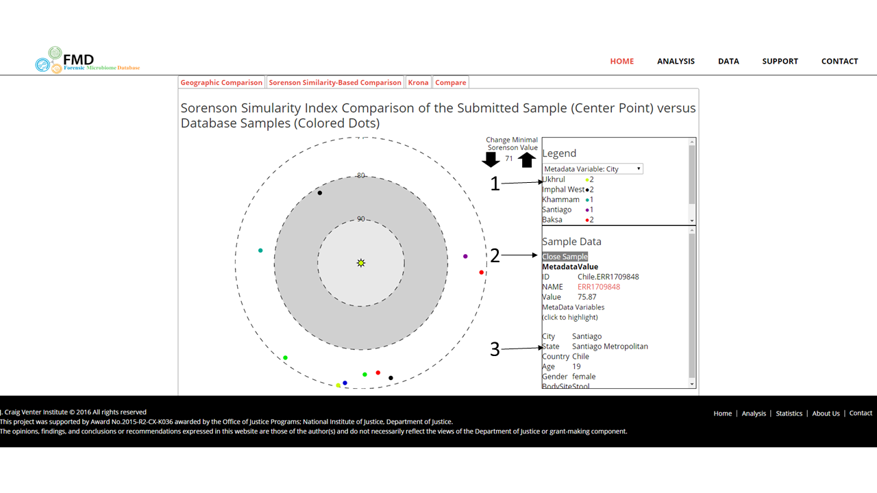
The user can highlight all the reference samples with a given metadata value by clicking it in the legend (1). The selected value will be highlighted. Clicking on a point will show all the available metadata in the lower right box (2). The user can also change the metadata variable by clicking on the desired row (3)
.
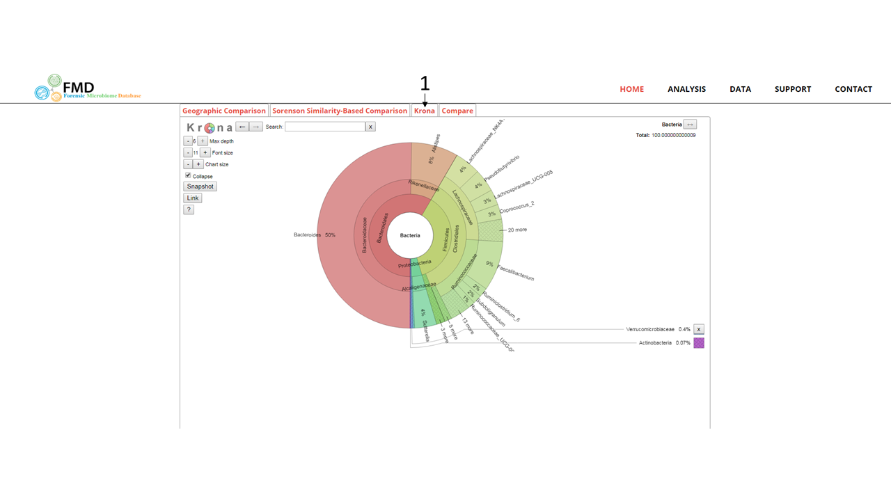
The user can also more closely examine the taxonomic distribution of the OTUs using the Krona pie chart. In the Krona pie chart, the percentage of sequenced 16S rRNAs assigned to each taxonomic unit is shown as a percentage of the circumference. Taxonomic regions in the graph can be expanded by double clicking on the colored areas. Further information on Krona pie charts and their functionality can be found using this link or by clicking on the "?" button on the graph. It is accessible by clicking on the tab shown at (1)
.
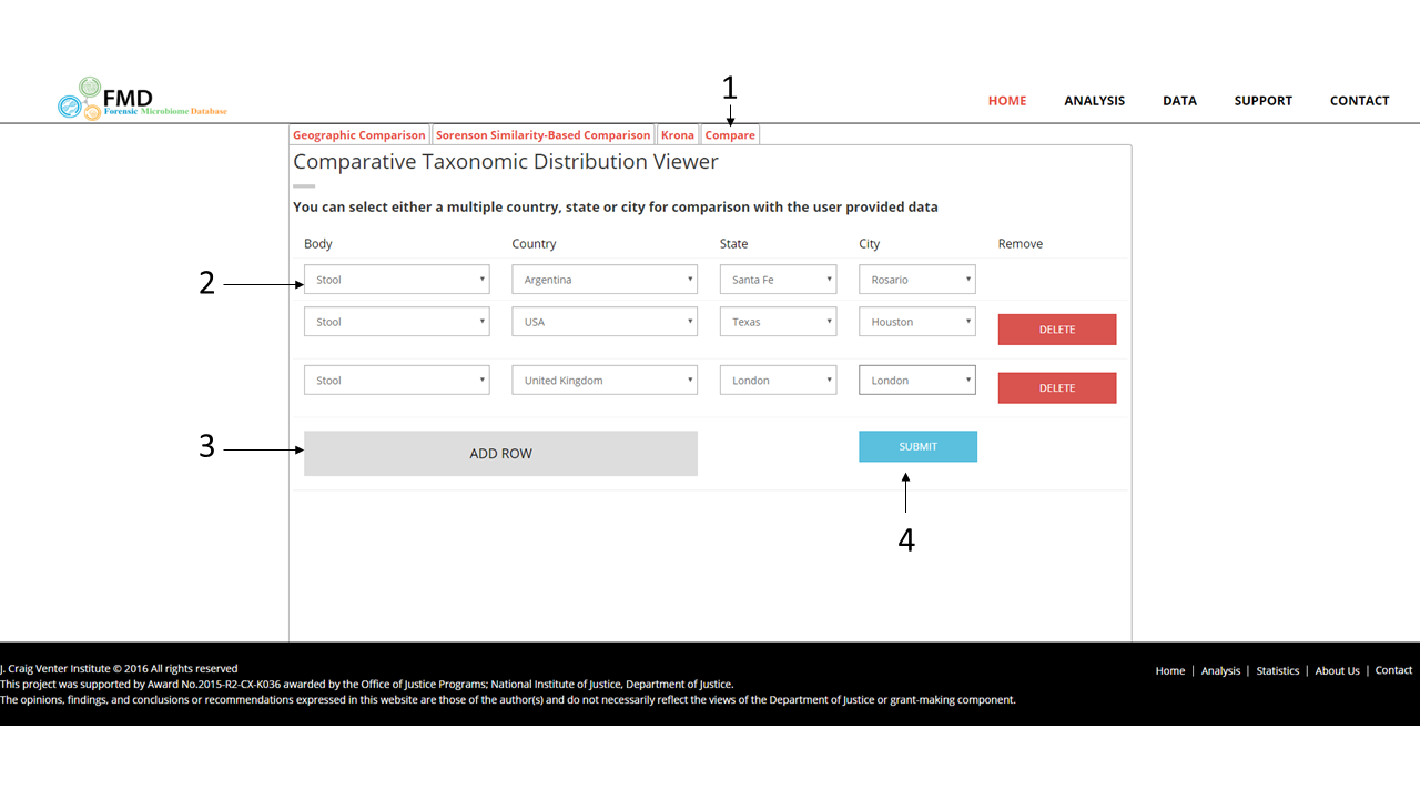
Finally, the user can compare the Genus levels of their sample with to certain geographic location and body sites in the FMD. It is accessible by clicking on the tab shown at (1) and then the body site and locations can be entered per each row (2). Additional rows can be added by using the button at (3) and once all the desired rows are entered, the bar chart comparisons can be generated using the submit button (4)
.
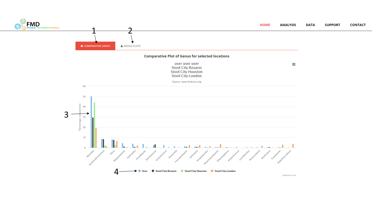
The resulting page resets the tabs, with only the comparative bar graphs (1) and the Krona pie charts (2) available to the user. The comparative graph (shown) contains the percentage of each genus in the different locals and in the user-provided sample (3) with each location and the user sample are shown in different colors (4). Only the top 10 genera in the user-provided are shown, in order from the highest at the left-most. The Krona pie chart page (not shown here) contains the same as before for the user provided sample, with the Krona pie charts for the other geographic locals also shown stacked below the user sample.
Comparison of 16S rRNA-based Taxonomic Distribution for a Geographic Location
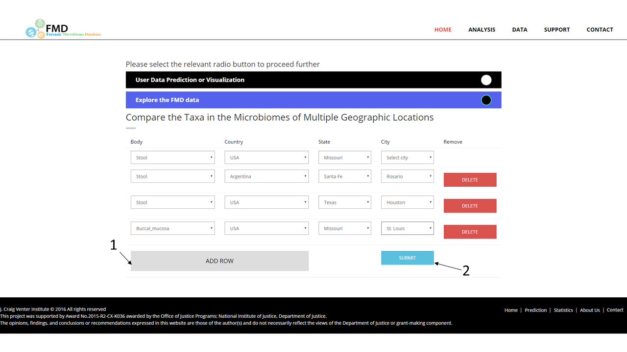
The FMD allows users to examine the taxonomic distribution of all the samples in the FMD collected in a single geographic location from a single body site or to compare it to other geographic locations. It can be accessed from the main page in two ways, via the menu, selecting "Analysis" (1) or using the footer menus (2). A body site (the left-most menu) has to be selected first. The country menu is then auto-populated with available data from the selected body site and so on. After at least one geographic local (country/state/tict) have been chosen, click on the submit button (3). Additional rows can be added for comparisons (4).
When the additional rows are added by using the button at (1) and once all the desired rows are entered, the bar chart comparisons can be generated using the submit button (4).
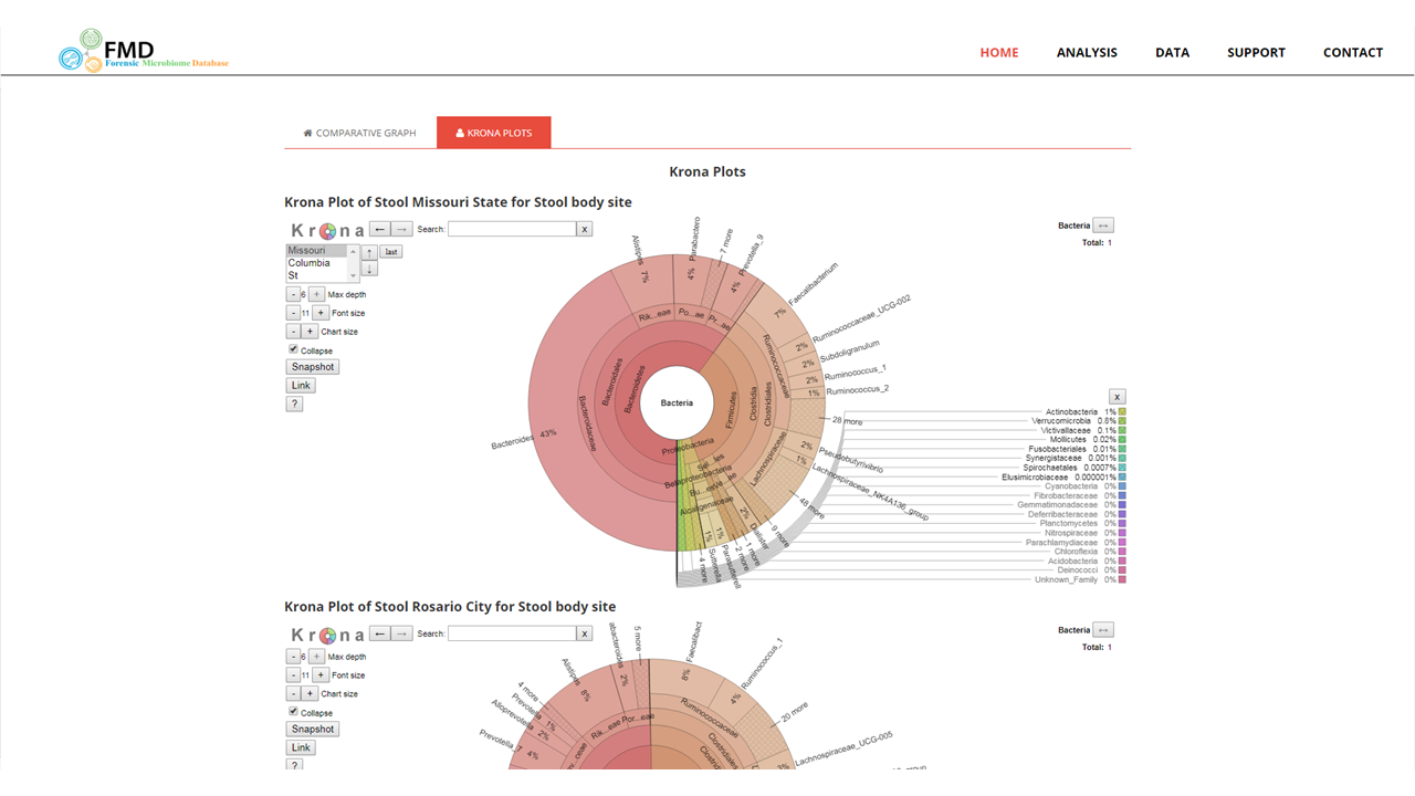
Comparative Taxonomic Distribution Viewer
The taxonomy are also shown as a Krona pie chart, where the percentage of sequenced 16S rRNAs assigned to each taxonomic unit is shown as a percentage of the circumference (1). Different taxonomic levels are shown along the radius of the chart (2). Taxonomic regions in the graph can be expanded by double clicking on the colored areas. Geographic sub-divisions of the selected geographic location can be accessed using the menu on the top left (3). Further information on Krona pie charts and their functionality can be found using this link or by clicking on the "?" button on the graph (4). When multiple locations are selected, the krona pie charts are stacked on top of each other.
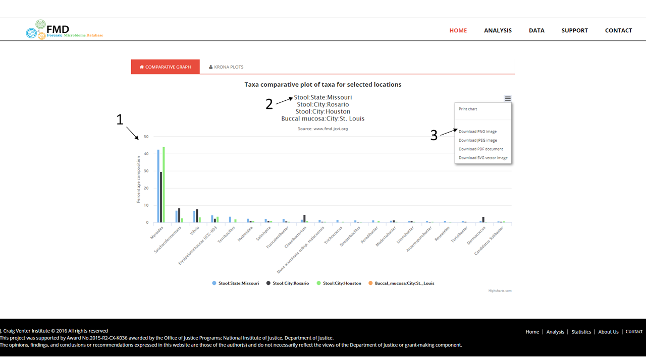
Result Page
The results page shows the proportion of the top twenty groups at the selected taxonomic levels in each of the selected geographic locations as a bar graph (1), using the ranks from the initially selected location (2). Hovering over the bars will show the exact percentage as a text box. The image can be saved in multiple formats (3).
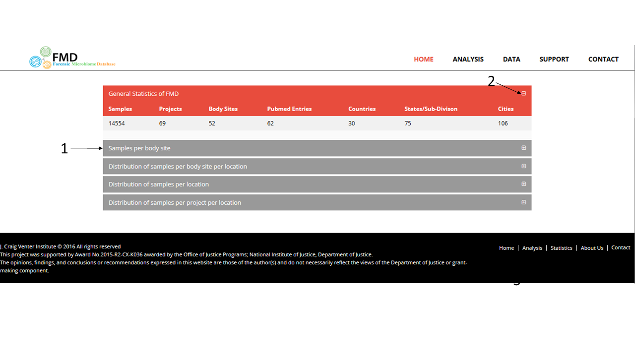
FMD Data Statistics
The data statistics page contains several descriptive counts of the 16s rRNA sequence data available in the FMD. These include:
- The number of high quality samples per body site
- The number of these samples in each body site in each geographic location, including country, state, and city
- The number of these samples in each geographic location, including country, state, and city from all body sites
- The number of these samples in each geographic location, including country, state, and city broken down by study